Provanity Podcast (2025)

By Lolita Jewelry for Lunamor Lingerie’s 2021 Valentine’s Day Campaign
-
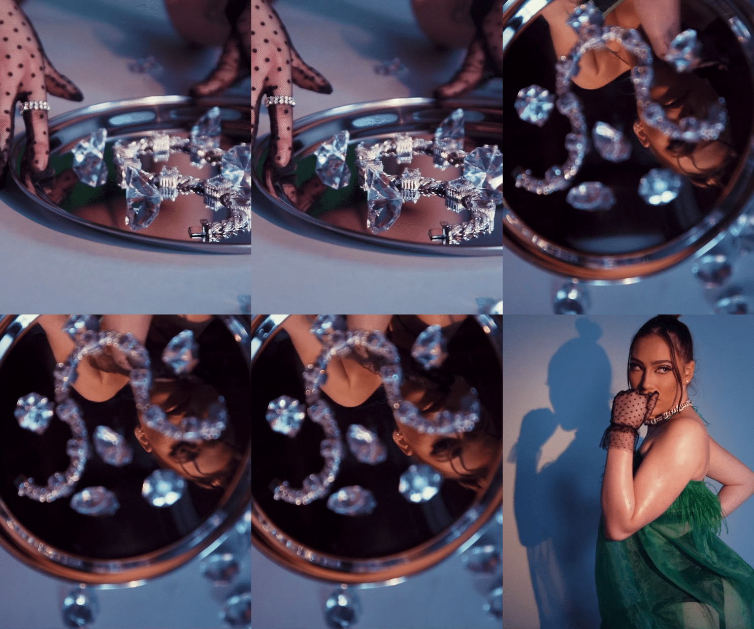
It was intended for By Lolita Jewelry to make a strong appearance in Lunamor Lingerie’s 2021 Valentine’s Day special. I wanted a ‘diamonds are a girl’s best-friend’ moment, without the cliche ensemble. The client and I wanted old-fashion glamour, while not being too traditional for this holiday.
-
Our first step in the product development process was to choose a color not commonly used on Valentine’s Day. Since this concept focuses on jewelry, a gem that came to mind was emerald. As the color green can mean energy, life and hope. It’s also a humorous oxymoron to the color representing materialism and greed.
The client and I moved forward into the design process, where we agreed to producing a slip. The client wanted a number that can be thrown on at home, whether the consumers have a partner or are using the holiday as a self-care day. The fuzzy lining brought a touch of character.
To continue with the old-fashion glamor, I added gloves, garter-belt pantyhose, classic pumps and 60s inspired makeup.
As the cherry on top, I wanted the jewelry to be the anticipated treat served on a platter.
-
This look was complete with the elaborate art direction. There were “diamonds” surrounding the By Lolita necklace and used as a trail towards the silver platter. Along with props, the lighting contributed a big part to achieving this glamorous look. The spotlight on the model was a part of making the person that wears the necklace feel special.
It was important for me to draw attention to the necklace and not the objects around it, when I edited the film. The lighting of both the model and the merchandise brought the chic glamor look together.

‘Brown Sugar’ for Lunamor Lingerie’s 2021 Valentine’s Day Campaign
-
Lunamor Lingerie’s 2021 Valentine’s Day special was far from traditional. The client wanted to steer away from red or pink colors. The goal was also to not forget that it’s Black History Month because of the holiday and show the beauty of dark skin Black women with type-4-hair.
-
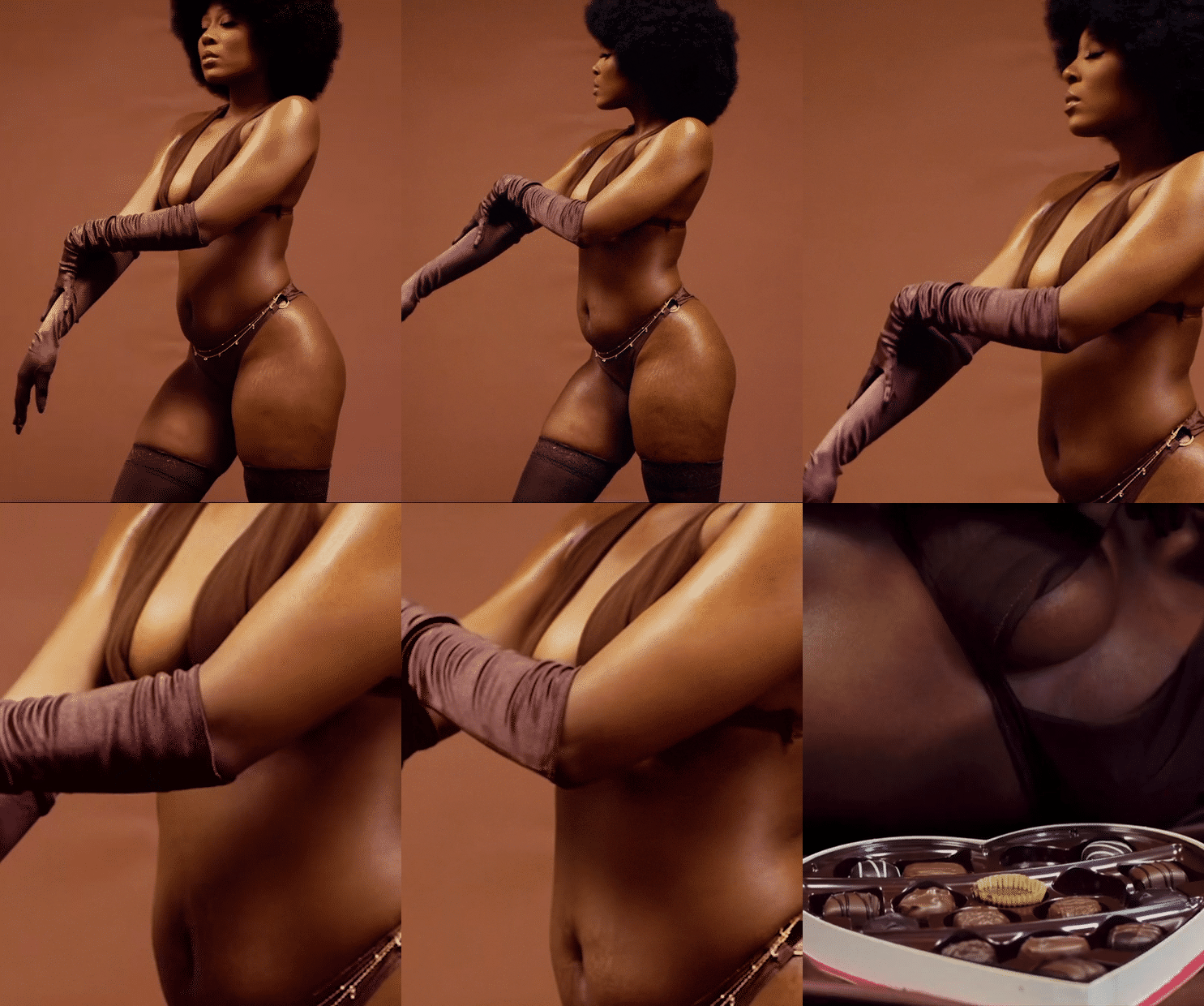
The first step to going the untraditional route was selecting the color. The client and I decided on a nude color geared towards highly melanated women.
After the color was selected, we stayed true to the essence of the brand that is comfortability. For the design, the client and I agreed to a bra and panty set. With such simplicity, it was key to emphasize on the quality of the merchandise.
Since this was a basic set, I wanted the look to feel luxurious. It’s easy for consumers to misinterpret the quality of merchandise from a digital lens. A monochromatic look can transform feeling basic to high-end. To achieve the monochromatic look with a lingerie line, I added satin gloves and mesh stockings. The body-chain was to add a touch of glamour that didn’t overshadow the concept of the look. As for the clear platform heels, it elongated the model and tapped into a different version of “sexy.”
-
The look carried on and finally transpired. To continue with the monochromatic theme, that included the art direction. There were brown satin sheets, a brown backdrop, and a box of chocolates to remind consumers that this is for Valentine’s Day.
In addition, the model touching herself was crucial to portraying the quality of the set and how it makes an individual feel. I edited the film to zero in on those moments.

‘Power’ for Lunamor Lingerie’s 2021 Valentine’s Day Campaign
-
For this 2021 Valentine’s Day special, the client did not want to utilize the traditional red or pink colors. The goal was to reach consumers that weren’t a fan of traditional and share a different perspective of what’s “sexy.”
-
To divert from traditional, the client and I first started going over the color schemes. Sometime classics never fail and can be innovative at the same time. Black was a color that we couldn’t ignore.
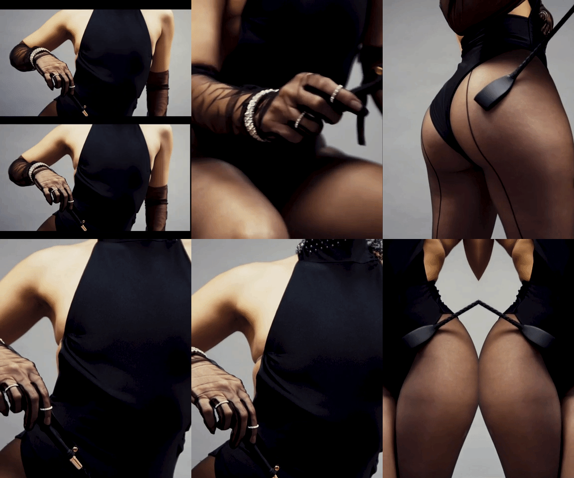
After selecting the color, we then moved forward with the design. Comfortability was also a priority in this piece and was geared towards consumers that might want to put on a little performance for the special holiday. That’s when the bodysuit was born.
Although the design was complete, the look still needed to be finalized. It was essential for there to be simplicity but still eclectic. I had to keep in mind that this is far from a traditional Valentine’s Day campaign. I wanted to continue reaching various audiences. Those that want to feel either elegant, comfy, glamorous or powerful. The idea to keep it minimal from the accessories to the art direction was to not overwhelm those that were new to buying lingerie for the holiday, while still appealing to others that desire the glam.
Mild dominatrix was the overall inspiration and theme of the look. I wanted to express a unique perspective of sexuality that exuded power. That’s when the look came together with the head piece and the whip.
-
The vision doesn’t end at product development and style. The way the model is portrayed has bigger impact in fully executing. Many of the poses aimed to display the ability to move in the merchandise. Also, the stances intended to radiate power in both sexuality and body.
Additionally, Pash edited the film to highlight the power and elegance in simplicity. Ideally, to show that being dominate in the bedroom does not have to be scary.